partners for life
Business Branding – Creating, Updating & Evolving
As accountants and business advisers, we help clients every day with the behind-the-scenes operations of their business. While tax, compliance, strategy, bookkeeping, and insurance are all critical components of running a business, the “look & feel” of things can often take a back seat. Business branding is an important piece of the puzzle not only from a professionalism point of view, but also from a recognition and public profile perspective. In this article, we’ll look at why creating a brand is important, how updating a brand can refresh an existing business, and look at a few interesting case studies from around the world.
Creating a Brand
Creating a brand for your business extends far beyond just throwing together a quick logo and selecting a favourite font for your letterhead. The best and most instantly recognisable brands in the world tell a story about what the business is all about, what they do, what they value, and importantly, creates a quick recall response when people are exposed to it. When deciding what your brand story will be, think about the emotion or feeling that best compliments your business. For example, Apple are well-known for their simplistic product design and a desire to make their customers’ lives easier. The simple, clean, and uncomplicated nature of the Apple logo reflects this.
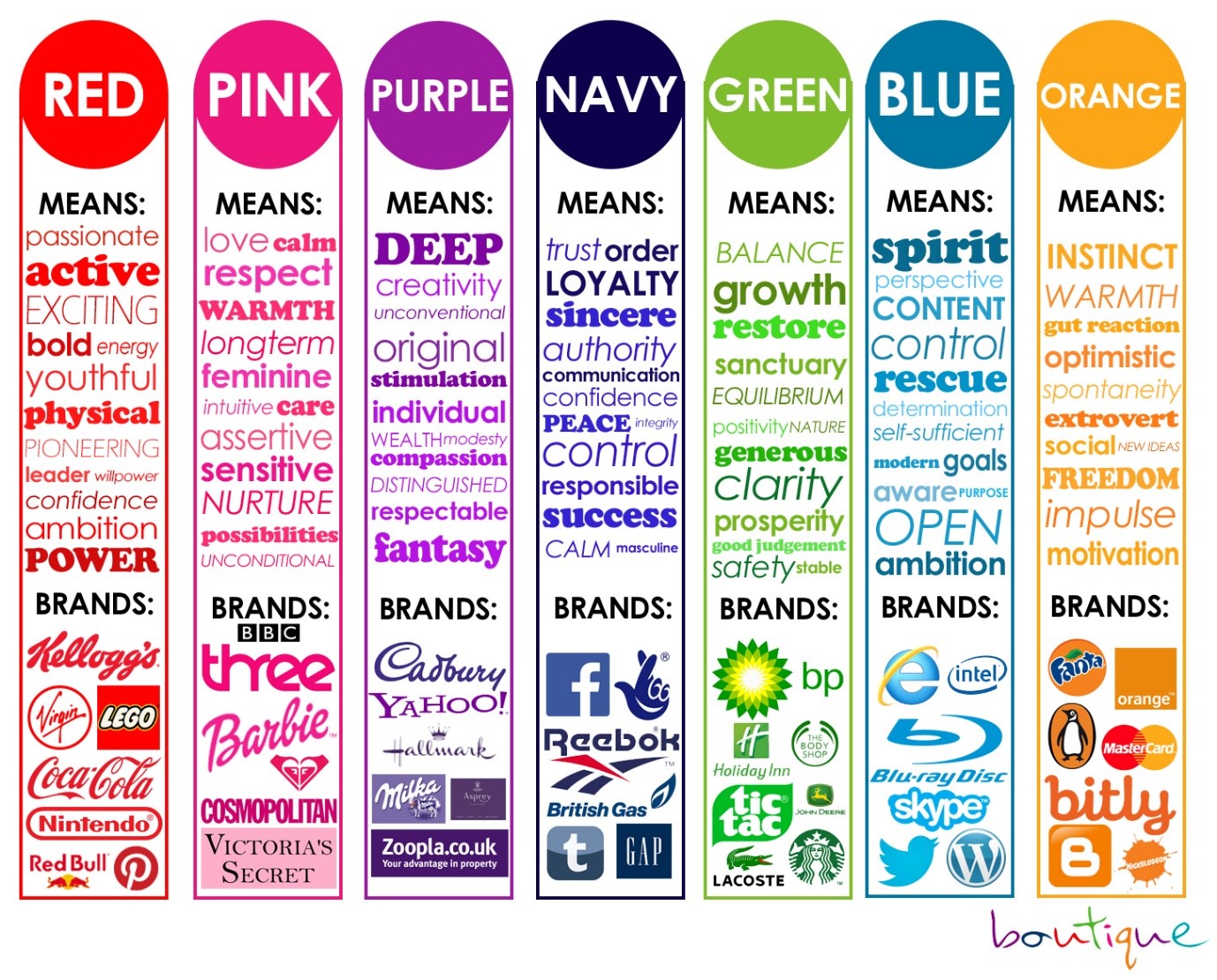
The colour of business branding is also an important consideration. Many businesses within a given industry may opt for the same colour as it matches their product or service offering (e.g. plumbers using blue, fresh food retailers using green). Some may fall into the trap of trying to differentiate themselves too much, and risk having a brand that doesn’t resonate with their target market. The psychology of branding colours shows that businesses within the same industry don’t necessarily have to go for the same colour, rather they recognise that certain colours elicit an emotion – and this is where they can attach their brand and business to a feeling, as opposed to just a simple association with their product. See below for an example of which colours are often associated with different emotional responses.

Brand Colour Psychology
Source: https://visme.co/blog/color-psychology-in-marketing-and-brand-identity-part-2/
Updating a Brand
Having a brand story, logo, collateral, and stationery for your business is something that can be attained even before you begin trading. But what do you do if you’re feeling limited by the same branding you’ve had for years? Updating a band can be motivated by a few different things – you might be re-launching with a new range of products or services; expanding your reach into a new industry; or maybe it’s just time. Whatever the case may be, refreshing the look and feel of your brand can open new opportunities for your business, and better reflect where it’s at right now.
Consider what sets you apart from your competitors, and why your customers keep coming back for your product or service. Using this information in your rebrand and tailoring your new look in a way that is relevant to your target market is critical in ensuring it has the best chance of success. When rebranding, some companies know exactly who their target market is, what they want to achieve, why their customers love them, and how to update their look and feel without losing what makes them unique. Below are a couple of case studies – one where things went well, and one where they didn’t.
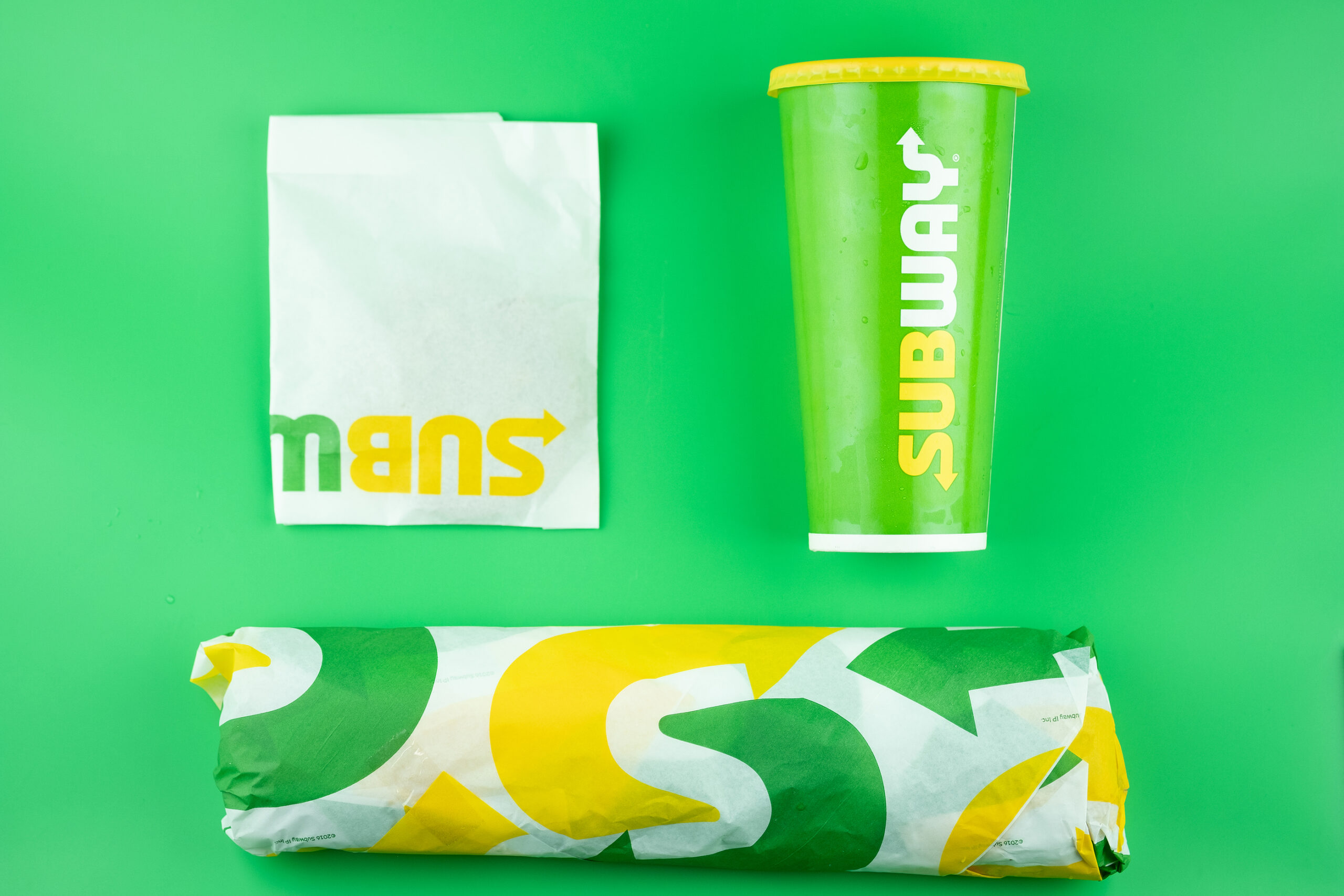
Subway: Sandwich giant Subway noticed a few years ago that their sales were falling, and competitors in the fast-food market were starting to gain traction in the “healthy options” market – where Subway had been dominant for so long. This forced their hand and they decided to go for a rebrand and update their logo and visual marketing. Their new logo is fundamentally similar to their previous one, where a more modern take on it harks back to their heritage and principles while also positioning them as a modern and “fresh” company. A re-think of the “S” logo involves the company’s two main colours and iconic two arrows, condensing them into one simple icon. This rebrand was a success because it was well-thought out, purposeful and relevant for their audience.

SUBWAY
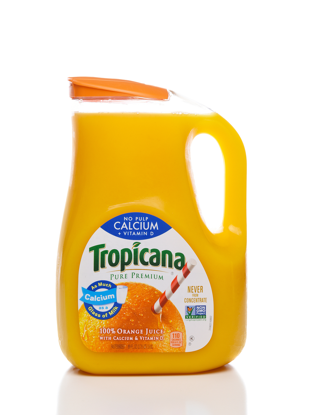
Tropicana Fruit Juice: Tropicana, a juice manufacturer owned by PepsiCo, rebranded in 2008 – only problem was, they didn’t really need it. After an investment of USD$35 million and months of hard work, their iconic packaging was replaced with a watered-down, bland, store-brand looking design which eventually led to a first month sales loss of USD$20 million. After one month, they reverted to their original packaging. This is a prime example of a rebrand that not only didn’t work, it wasn’t necessary in the first place.

TROPICANA
What’s Next for Your Brand?
With our understanding of your business and industry, McKinley Plowman’s Brand Plus offering is available for those ready to take their business to the next level. With our extensive reach within the digital and creative industry, we’ll make sure your branding truly reflects what makes your business unique. Get in touch with us today on 08 9301 2200 (Joondalup) or 08 9361 3300 (Victoria Park), or contact us via our website.
Thinking about becoming a client?
Book your free, no obligation consultation right now via our online booking system or get in touch to find out more
Already a client and want to get in touch?
Send us an email via our enquiry form or give us a call today
